Lyon DataVis and AI mini-conference
Yesterday I went to this mini-conference at ENS Lyon and enjoyed it very much. Here is a very short description of the speakers/subjects:
Lane Harrison
Lane is studying how people interact with data visualization: how do they explore a complex visualization, where do they click, how many times… how to improve their understanding of complex data with visualization tools such as a simple search functionality, and more generally user-centered tools.
Yannick Assogba
This was really interesting to me. He is one of the developer of TensorFlow.js. He mentioned several things such as:
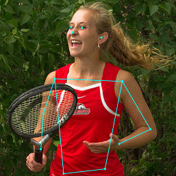
- TensorFlow.js implementation of PoseNet: PoseNet is based on a convolutional neural network and allow to detect a person in a video in real time with an accurate prediction of the body position. You can try a live demo here.
-
FACETS: Facets is a visualization tool to aid in understanding and analyzing machine learning datasets.
-
tensorboard: a suite of web applications for inspecting and understanding your TensorFlow runs and graphs.
Jim Vallandingham
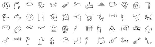
Great presentation about the quick draw game dataset, which can be found here: 50 million drawings across 345 categories.
An old version of his slides can be found here on his website.
Gabriel Florit
He is a graphics reporter on the investigative team at the Washington Post. He talked about many cool things: augmented reality, his project SCRIPT-8: a JavaScript fantasy console (“Make pixel-art games with a livecoding browser editor”), …
Arvind Satyanarayan
He is one of authors of Vega, which is a visualization grammar: a declarative language for creating, saving (in JSON), and sharing interactive visualization designs, and Vega-Lite. Here is a little example of an interactive moving average in Vega-Lite 2:
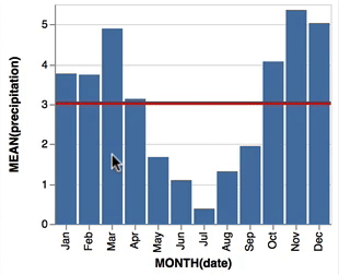
You can check the corresponding JSON file and play with this interactive plot here. This Vega-Lite visualization grammar is very powerful, and is also used in the Python Altair visualization library, created by Jake Vanderplas.
Here is a quote from the Vega website page describing the project:
Over years working in data visualization, we’ve sought to build tools that help designers craft sophisticated graphics, including systems such as Prefuse, Protovis and D3.js. However, in the grand scheme of things, “artisanal” visualizations hand-coded by skilled designers are the exception, not the rule. The vast majority of the world’s visualizations instead are produced using end-user applications such as spreadsheets and business intelligence tools. While valuable, these tools often fall short of fully supporting the iterative, interactive process of data analysis. Improved tools could help a larger swath of people create effective visualizations and better understand their data.
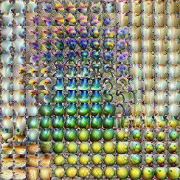
He was here to talk about deep learning and his work on The Building Blocks of Interpretability. This was fun!
Note that this last research work is presented on the Distill platform, which is a very powerful web medium to present ML top research.