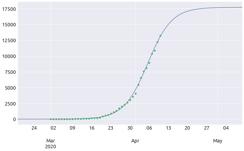
Fitting a logistic curve to time series in Python
In this notebook we are going to fit a logistic curve to time series stored in Pandas, using a simple linear regression from scikit-learn to find the coefficients of the logistic curve.
Disclaimer: although we are going to use some COVID-19 data in this notebook, I want the reader to know that I have ABSOLUTELY no knowledge in epidemiology or any medicine-related subject, and clearly state that the result of fitting logistic curve to these data is an incredibly simplistic and naive approach. The point of this post is not the COVID-19 at all but only to show an application of the Python data stack.
Edit: here is an interesting post about the difficulty of time series forecasting with logistic curves: Forecasting s-curves is hard by Constance Crozier.
Let’s start by decribing the logistic curve.
The Logistic curve
A logistic curve is a common S-shaped curve (sigmoid curve). It can be usefull for modelling many different phenomena, such as (from wikipedia):
- population growth
- tumor growth
- concentration of reactants and products in autocatalytic reactions
The equation is the following:
\[D(t) = \frac{L}{1 + e^{-k (t - t_0)}}\]where
- $t_{0}$ is the sigmoid’s midpoint,
- $L$ is the curve’s maximum value,
- $k$ is the logistic growth rate.
Here is an example of a logistic curve fitted to data of AIDS cases in the US:
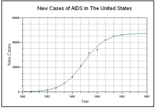
Source: http://www.nlreg.com/aids.htm
Let’s start by importing the libraries.
Imports
import itertools
from datetime import timedelta

import numpy as np
from matplotlib import pyplot as plt
plt.style.use("seaborn")
import pandas as pd
from sklearn.linear_model import LinearRegression

FS = (16, 9)  # figure size
The Parameters
We have 3 parameters in the logistic curve: $k$, $t_0$ and $L$. In the following we are going to vary each parameter in order to see their respective influence.
t = np.linspace(-5, 15, 1000)

fig = plt.figure(figsize=(10, 18))

ax = fig.add_subplot(3, 1, 1)
t0, L = 5., 10000.
for k in [0.5, 1., 2., 4.]:
    D = L / (1. + np.exp(-k * (t - t0)))
    _ = plt.plot(t, D, label=f'k={k}')
_ = ax.legend()
_ = ax.set_xlabel('t')

ax = fig.add_subplot(3, 1, 2)
L, k = 10000., 2
for t0 in [2 , 4, 6, 8]:
    D = L / (1. + np.exp(-k * (t - t0)))
    _ = plt.plot(t, D, label=f't0={t0}')
_ = ax.legend()
_ = ax.set_xlabel('t')

ax = fig.add_subplot(3, 1, 3)
t0, k = 5., 2
for L in range(4, 8):
    L *= 2000
    D = L / (1. + np.exp(-k * (t - t0)))
    _ = plt.plot(t, D, label=f'L={L}')
_ = ax.legend()
_ = ax.set_xlabel('t')
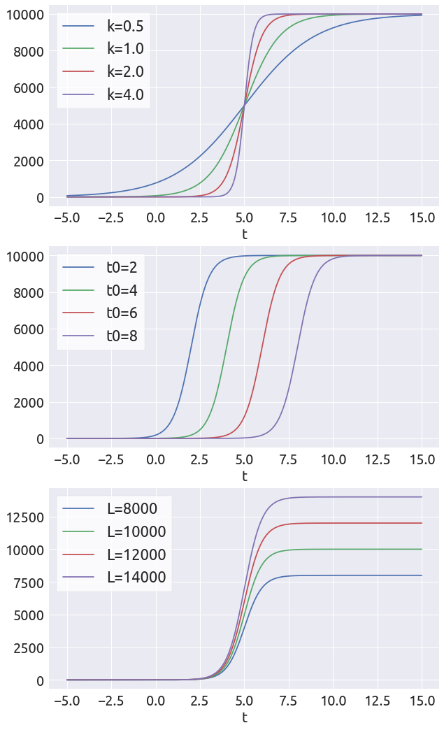
So how are we going to fit these paramters? We are going to use a linear regression to find some values for $k$ and $L$, and then estimate $t_0$ manually.
In order to get a linear equation, we need to describe the logistic differential equation.
The logistic differential equation
If we differentiate $D$, we get the following differential relationship, for a given value of $t_0$ (each step broken down):
\[\frac{dD}{dt} = L (-1) (-k) e^{-k (t - t_0)} \left(1 + e^{-k(t-t_0)} \right)^{-2}\] \[= k \frac{L}{1 + e^{-k(t-t_0)}} \left( \frac{ e^{-k(t-t_0)}}{1 + e^{-k(t-t_0)}} \right)\] \[= k D \left( \frac{ 1+ e^{-k(t-t_0)} - 1}{1 + e^{-k(t-t_0)}} \right) = k D \left( 1 - \frac{D}{L} \right)\]As you can infer from this equation, the proportional growth rate $\frac{dD / dt}{D}$ is a linear function of $D$:
\begin{equation} \frac{dD / dt}{D} = k \left( 1 - \frac{D}{L} \right) \end{equation}
So the basic idea for fitting a logistic curve is the following:
- plot the proportional growth rate as a function of $D$
- try to find a range where this curve is close to linear
If we actually find a “large” interval of data for which the proportional growth rate is a linear function of $D$:
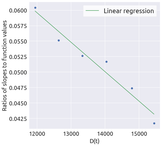
- find the coefficients of the linear function $y=ax+b$ using a linear regression
- compute $L$ and $k$ from these coefficient ($k=b$, $L=-k/a$)
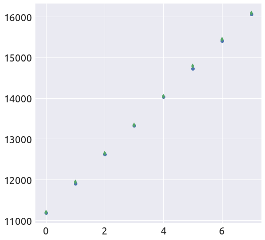
- find a value of $t_0$ such that the logistic curve is as close as possible to the data on the interval of data (for which the proportional growth rate is a linear function of $D$)
Note that this process is very subjective! When applied to real data, we rarely find a strictly linear proportional growth rate and can very different sigmoid shapes just by choosing different intervals on which we apply the linear regression. Just because we can technically fit a line to a point cloud does not mean that it is appropriate.

source: https://xkcd.com/1725/
Data
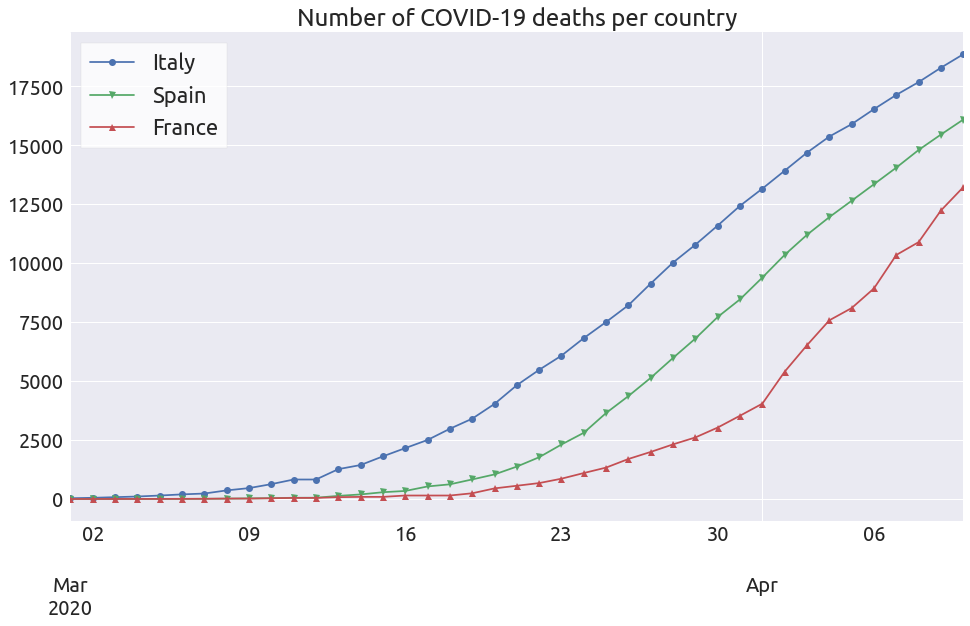
The data comes from the 2019 Novel Coronavirus COVID-19 (2019-nCoV) Data Repository by Johns Hopkins CSSE on github. We are going to look at the deaths-by-country time series.
url = 'https://raw.githubusercontent.com/CSSEGISandData/COVID-19/master/csse_covid_19_data/csse_covid_19_time_series/time_series_covid19_deaths_global.csv'
df = pd.read_csv(url)
total = df.drop(['Province/State', 'Lat', 'Long'], axis=1).groupby('Country/Region').sum().max(axis=1).sort_values(ascending=False)
countries = total.index.to_list()
deaths = pd.DataFrame()
for country in countries:
    temp = df[df['Country/Region'] == country][df.columns[4:]].T.sum(axis=1)
    temp.index = pd.to_datetime(temp.index)
    temp = temp.to_frame(country)
    deaths = pd.concat([deaths, temp], axis=1)
start = '2020-03'
ax = deaths[['Italy', 'Spain', 'France']][start:].plot(style='-', figsize=FS)
markers = itertools.cycle(("o", "v", "^", "<", ">", "s", "p", "P", "*", "h", "X", "D", '.'))
for i, line in enumerate(ax.get_lines()):
    marker = next(markers)
    line.set_marker(marker)
_ = ax.legend()
_ = ax.set_title("Number of COVID-19 deaths per country")
Functions
For each of these 3 countries we are going to try to fit a logistic curve, using the following 4 functions:
def plot_ratios(country, death_min=0, death_max=None):
    """ Plot the proportional growth rate with respect to D,
        on the interval (death_min, death_max).
    """
    country = country[country > death_min]
    if death_max is not None:
        country = country[country < death_max]
    slopes = 0.5 * (country.diff(1) - country.diff(-1))
    ratios = slopes / country
    x = country.values[1:-1]
    y = ratios.values[1:-1]
    fig = plt.figure(figsize=(8, 8))
    ax = fig.add_subplot(1, 1, 1)
    _ = plt.plot(x, y, 'o')
    _ = ax.set_xlabel('D(t)')
    _ = ax.set_ylabel('Ratios of slopes to function values')
    return x, y
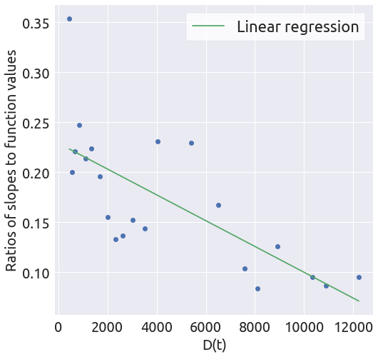
def linear_regression(x, y):
    """ Find the coefficients of the linear function  y=ax + b,
        using a linear regression.
    """
    X = x.reshape(-1, 1)
    reg = LinearRegression(fit_intercept=True, normalize=True)
    _ = reg.fit(X, y)
    a = reg.coef_[0]
    b = reg.intercept_
    y_hat = a * x + b
    fig = plt.figure(figsize=(8, 8))
    ax = fig.add_subplot(1, 1, 1)
    _ = plt.plot(x, y, 'o')
    _ = plt.plot(x, y_hat, '-', label='Linear regression')
    _ = ax.set_xlabel('D(t)')
    _ = ax.set_ylabel('Ratios of slopes to function values')
    _ = ax.legend()
    return a, b
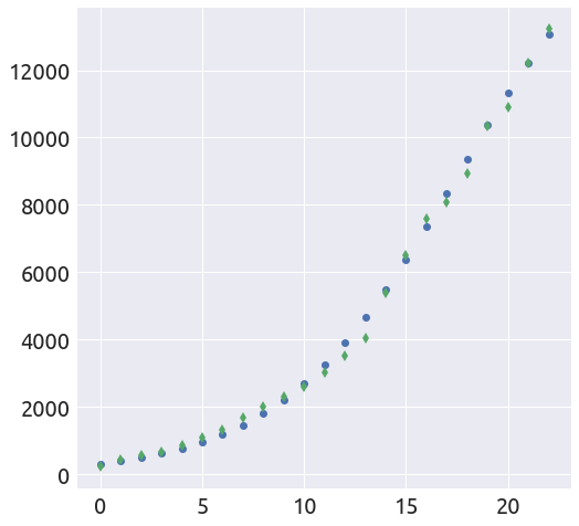
def plot_t0(a, b, country, death_min=0, death_max=None, t0=0):
    """ Find a value of t0 such that the logistic curve is as close
        as possible to the data on the given interval.
    """
    k = b
    L = -b / a
    country = country[country > death_min]
    if death_max is not None:
        country = country[country < death_max]
    logis = L / (1. + np.exp(-k * (np.arange(len(country)) - t0)))
    fig = plt.figure(figsize=(8, 8))
    ax = fig.add_subplot(1, 1, 1)
    _ = plt.plot(logis, 'o')
    _ = plt.plot(country.values, 'd')
    return L, k
def extended_plot(country, death_min, L, k, t0, days_before=30, days_after=30, figsize=(16, 9)):
    """ Plot the logistic curve on an extended interval,
        against the real data.
    """
    country_original = country.copy(deep=True)
    country = country[country > death_min]
    country = country.to_frame('Deaths')
    country_start = country.index.min()
    country_end = country.index.max()
    start=country_start - timedelta(days=days_before)
    end=country_end + timedelta(days=days_after)
    ix = pd.date_range(start=start, end=end, freq='D')
    country = country.reindex(ix)
    country['idx'] = np.arange(len(country))
    country['idx'] -= country.loc[country_start, 'idx']
    country['logistic'] = L / (1. + np.exp(-k * (country['idx'].values - t0)))
    ax = country['logistic'].plot(figsize=figsize,logy=False)
    _ = country_original[start:].plot(ax=ax, style='o')
Italy
country_name = 'Italy'
country = deaths[country_name]
x, y = plot_ratios(country)
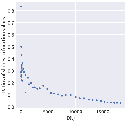
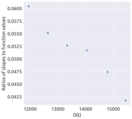
It looks like the slope is changing several times. Let’s focus on the last part of the curve.
death_min = 11000
x, y = plot_ratios(country, death_min)
a, b = linear_regression(x, y)
t0 = 1.5
L, k = plot_t0(a, b, country, death_min, t0=t0)
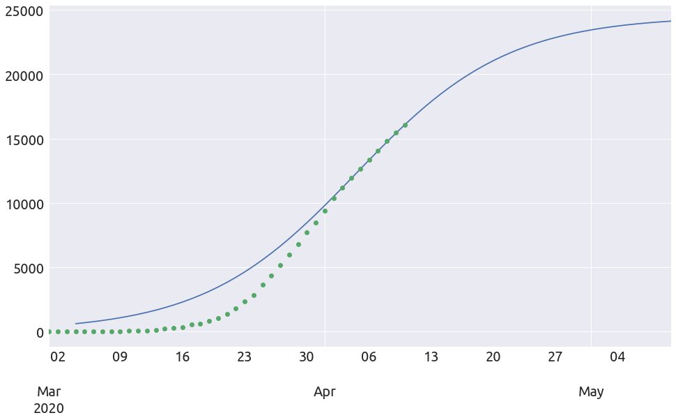
extended_plot(country, death_min, L, k, t0, figsize=FS)
Spain
country_name = 'Spain'
country = deaths[country_name]
x, y = plot_ratios(country)
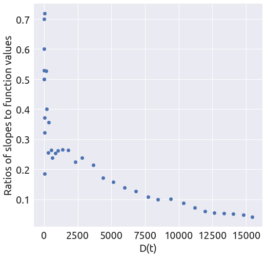
Again, it looks like a piecewise linear curve and we are going to focus on the last part of the curve.
death_min = 11000
x, y = plot_ratios(country, death_min)

a, b = linear_regression(x, y)

t0 = 1.5
L, k = plot_t0(a, b, country, death_min, t0=t0)

extended_plot(country, death_min, L, k, t0, figsize=FS)

France
country_name = 'France'
country = deaths[country_name]
x, y = plot_ratios(country)
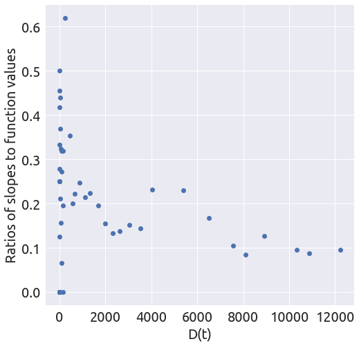
It does not look linear at all, but let’s proceed with the regression anyway.
death_min = 200
x, y = plot_ratios(country, death_min)
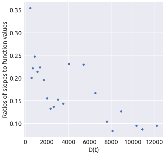
a, b = linear_regression(x, y)
t0 = 17.5
L, k = plot_t0(a, b, country, death_min, t0=t0)
extended_plot(country, death_min, L, k, t0, figsize=FS)
