Lunch break, plotting excess death in french department zones with Python
Daily deaths data are provided by INSEE (the national institute of statistics and economic studies). Here is the link of the page displaying these data, and here is a short description:
During the Covid-19 pandemic, INSEE is reporting the number of deaths per day per department on a weekly basis. Deaths are recorded in the commune in which they occur (and not in the place of residence of the deceased).
We downloaded the smallest CSV file:
The two downloadable files below were uploaded on 29 May 2020 and relate to the cumulative number of daily deaths from 1 March to 18 May 2018, 2019 and 2020 and the number of daily deaths reported electronically up to 22 May.
Now let’s try to visualize these data.
Imports
from datetime import datetime

import pandas as pd
import geopandas as gpd
import matplotlib.dates as mdates
import matplotlib.pyplot as plt
import colorcet as cc

color_list = cc.glasbey_category10
plt.rcParams["axes.prop_cycle"] = plt.cycler(color=color_list)

%load_ext lab_black

FS = (16, 9)

csv_file_path = "./data/INSEE/2020-05-29_deces_quotidiens_departement_csv.csv"
Load the CSV file
df = pd.read_csv(csv_file_path, sep=";")
df.info()
<class 'pandas.core.frame.DataFrame'>
RangeIndex: 9384 entries, 0 to 9383
Data columns (total 8 columns):
 #   Column                                    Non-Null Count  Dtype
---  ------                                    --------------  -----
 0   Date_evenement                            9384 non-null   object
 1   Zone                                      9384 non-null   object
 2   Communes_a_envoi_dematerialise_Deces2020  8466 non-null   float64
 3   Total_deces_2020                          8058 non-null   float64
 4   Communes_a_envoi_dematerialise_Deces2019  9384 non-null   int64
 5   Total_deces_2019                          9384 non-null   int64
 6   Communes_a_envoi_dematerialise_Deces2018  9384 non-null   int64
 7   Total_deces_2018                          9384 non-null   int64
dtypes: float64(2), int64(4), object(2)
memory usage: 586.6+ KB
The different values of Zone are the different french department zones, or the whole country:
df.Zone.unique()
array(['France', 'Dept_01', 'Dept_02', 'Dept_03', 'Dept_04', 'Dept_05',
       'Dept_06', 'Dept_07', 'Dept_08', 'Dept_09', 'Dept_10', 'Dept_11',
       'Dept_12', 'Dept_13', 'Dept_14', 'Dept_15', 'Dept_16', 'Dept_17',
       'Dept_18', 'Dept_19', 'Dept_21', 'Dept_22', 'Dept_23', 'Dept_24',
       'Dept_25', 'Dept_26', 'Dept_27', 'Dept_28', 'Dept_29', 'Dept_2A',
       'Dept_2B', 'Dept_30', 'Dept_31', 'Dept_32', 'Dept_33', 'Dept_34',
       'Dept_35', 'Dept_36', 'Dept_37', 'Dept_38', 'Dept_39', 'Dept_40',
       'Dept_41', 'Dept_42', 'Dept_43', 'Dept_44', 'Dept_45', 'Dept_46',
       'Dept_47', 'Dept_48', 'Dept_49', 'Dept_50', 'Dept_51', 'Dept_52',
       'Dept_53', 'Dept_54', 'Dept_55', 'Dept_56', 'Dept_57', 'Dept_58',
       'Dept_59', 'Dept_60', 'Dept_61', 'Dept_62', 'Dept_63', 'Dept_64',
       'Dept_65', 'Dept_66', 'Dept_67', 'Dept_68', 'Dept_69', 'Dept_70',
       'Dept_71', 'Dept_72', 'Dept_73', 'Dept_74', 'Dept_75', 'Dept_76',
       'Dept_77', 'Dept_78', 'Dept_79', 'Dept_80', 'Dept_81', 'Dept_82',
       'Dept_83', 'Dept_84', 'Dept_85', 'Dept_86', 'Dept_87', 'Dept_88',
       'Dept_89', 'Dept_90', 'Dept_91', 'Dept_92', 'Dept_93', 'Dept_94',
       'Dept_95', 'Dept_971', 'Dept_972', 'Dept_973', 'Dept_974',
       'Dept_976'], dtype=object)
We start by creating a DatetimeIndex based on the 2020 year:
df["day"] = df.Date_evenement.map(lambda s: int(str(s).split("-")[0]))
df["month_name"] = df.Date_evenement.map(lambda s: str(s).split("-")[1])
df.drop("Date_evenement", axis=1, inplace=True)
df["month"] = df.month_name.replace({"mars": 3, "avr.": 4, "mai": 5})
df.drop(["month_name"], axis=1, inplace=True)
df["year"] = 2020
df["date"] = pd.to_datetime(df[["year", "month", "day"]])
df.drop(["year", "month", "day"], axis=1, inplace=True)
df.set_index("date", inplace=True)
df.info()
<class 'pandas.core.frame.DataFrame'>
DatetimeIndex: 9384 entries, 2020-03-01 to 2020-05-31
Data columns (total 7 columns):
 #   Column                                    Non-Null Count  Dtype
---  ------                                    --------------  -----
 0   Zone                                      9384 non-null   object
 1   Communes_a_envoi_dematerialise_Deces2020  8466 non-null   float64
 2   Total_deces_2020                          8058 non-null   float64
 3   Communes_a_envoi_dematerialise_Deces2019  9384 non-null   int64
 4   Total_deces_2019                          9384 non-null   int64
 5   Communes_a_envoi_dematerialise_Deces2018  9384 non-null   int64
 6   Total_deces_2018                          9384 non-null   int64
dtypes: float64(2), int64(4), object(1)
memory usage: 586.5+ KB
Note that 2020 is a leap year, but the earliest date here is in march anyway.
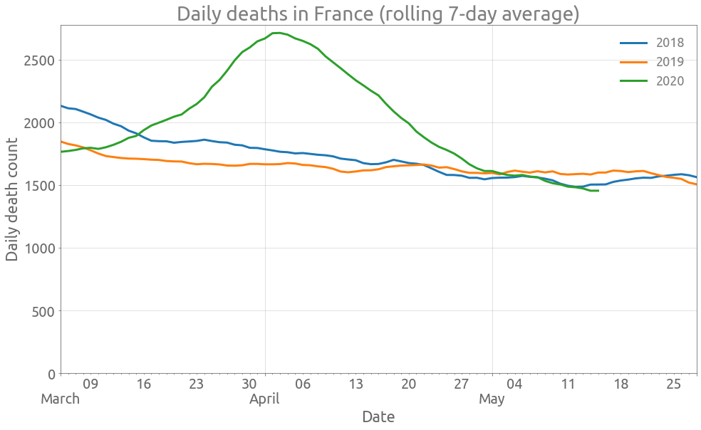
We start by plotting the daily deaths over the whole country.
France
zone = df[df.Zone == "France"][
    ["Total_deces_2018", "Total_deces_2019", "Total_deces_2020"]
].astype("Int64")
zone.head(2)
| Total_deces_2018 | Total_deces_2019 | Total_deces_2020 | |
|---|---|---|---|
| date | |||
| 2020-03-01 | 2136 | 1872 | 1778 |
| 2020-03-02 | 4327 | 3782 | 3557 |
ax = (
    zone[["Total_deces_2018", "Total_deces_2019", "Total_deces_2020"]]
    .astype(float)
    .diff()
    .rolling(7, center=True)
    .mean()
    .plot(figsize=FS, linewidth=3, grid=True)
)
_ = ax.set_ylim(0,)
_ = ax.set(
    title="Daily deaths in France (rolling 7-day average)",
    xlabel="Date",
    ylabel="Daily death count",
)
ax.autoscale(enable=True, axis="x", tight=True)
monthdayFmt = mdates.DateFormatter("%B")
ax.xaxis.set_major_formatter(monthdayFmt)
ax.tick_params(axis="x", which="major", pad=23)
_ = ax.legend(["2018", "2019", "2020"])
xticks = ax.xaxis.get_major_ticks()
xticks[-1].label1.set_visible(False)
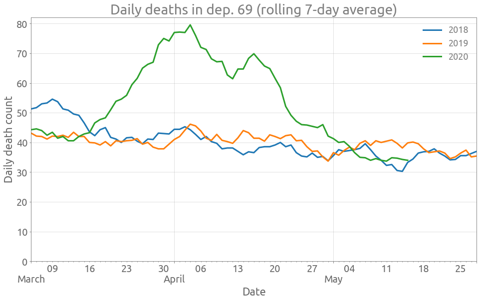
Now we are going to create a function for plotting the daily deaths in a department zone, and try it on the Rhône department.
Rhône (department zone)
def plot_dep(df, dep):
    zone = df[df.Zone == dep][
        ["Total_deces_2018", "Total_deces_2019", "Total_deces_2020"]
    ].astype("Int64")
    zone.head(2)
    ax = (
        zone[["Total_deces_2018", "Total_deces_2019", "Total_deces_2020"]]
        .astype(float)
        .diff()
        .rolling(7, center=True)
        .mean()
        .plot(figsize=FS, linewidth=3, grid=True)
    )
    _ = ax.set_ylim(0,)
    _ = ax.set(
        title=f"Daily deaths in dep. {dep.split('_')[-1]} (rolling 7-day average)",
        xlabel="Date",
        ylabel="Daily death count",
    )
    ax.autoscale(enable=True, axis="x", tight=True)
    monthdayFmt = mdates.DateFormatter("%B")
    ax.xaxis.set_major_formatter(monthdayFmt)
    ax.tick_params(axis="x", which="major", pad=23)
    _ = ax.legend(["2018", "2019", "2020"])
    xticks = ax.xaxis.get_major_ticks()
    xticks[-1].label1.set_visible(False)
plot_dep(df, "Dept_69")
Let’s try to find out which departments have been the most affected by COVID-19, with the relative and absolute differences between 2020 and the previous years. We first need to pivot the tables.
Pivot
dep_2018 = df[df.Zone != "France"][["Zone", "Total_deces_2018"]]
dep_2019 = df[df.Zone != "France"][["Zone", "Total_deces_2019"]]
dep_2020 = df[df.Zone != "France"][["Zone", "Total_deces_2020"]]
dep_2018 = (
    dep_2018.pivot(columns="Zone")
    .diff()
    .dropna(how="all")
    .astype("Int64")
    .droplevel(0, axis=1)
)
dep_2019 = (
    dep_2019.pivot(columns="Zone")
    .diff()
    .dropna(how="all")
    .astype("Int64")
    .droplevel(0, axis=1)
)
dep_2020 = (
    dep_2020.pivot(columns="Zone")
    .diff()
    .dropna(how="all")
    .astype("Int64")
    .droplevel(0, axis=1)
)
print(f"{dep_2020.index.min().date()} / {dep_2020.index.max().date()}")
2020-03-02 / 2020-05-18
Department zones with largest relative excess death
dep_avg = 0.5 * (dep_2018 + dep_2019).loc[dep_2020.index]
dep_diff_rel = 100 * (dep_2020 - dep_avg).sum(axis=0) / dep_avg.sum(axis=0)
dep_diff_rel_rank = dep_diff_rel.sort_values(ascending=False)
dep_diff_rel_rank.index = dep_diff_rel_rank.index.map(lambda s: s.split("_")[1])
ax = dep_diff_rel_rank[:15].plot.bar(
    figsize=FS, rot=0, grid=True, edgecolor="blue", alpha=0.25
)
_ = ax.set(
    title="Departments with largest relative excess death",
    xlabel="Department code",
    ylabel="Exces death (%)",
)
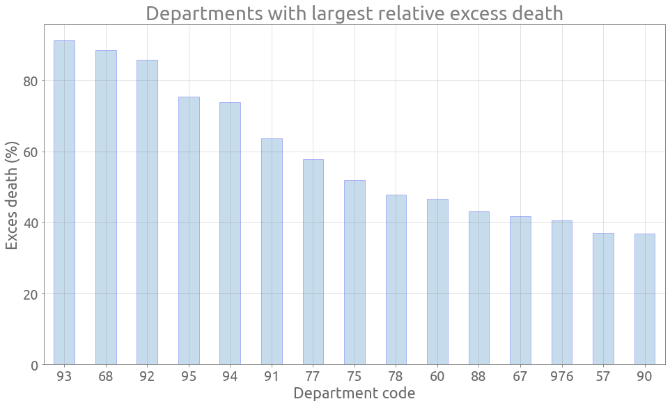
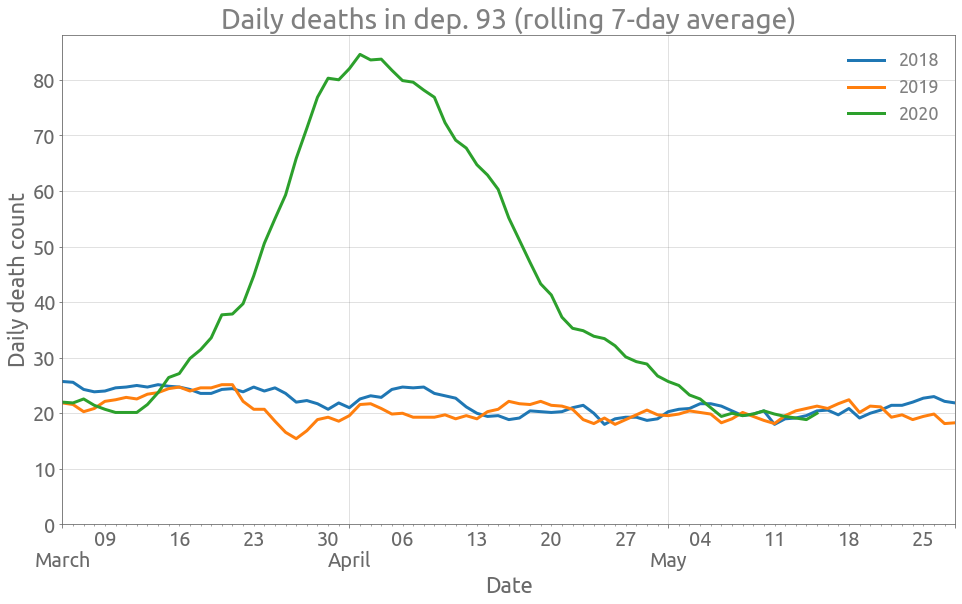
Here is the data for dep. 93 (Seine-Saint-Denis):
plot_dep(df, "Dept_93")
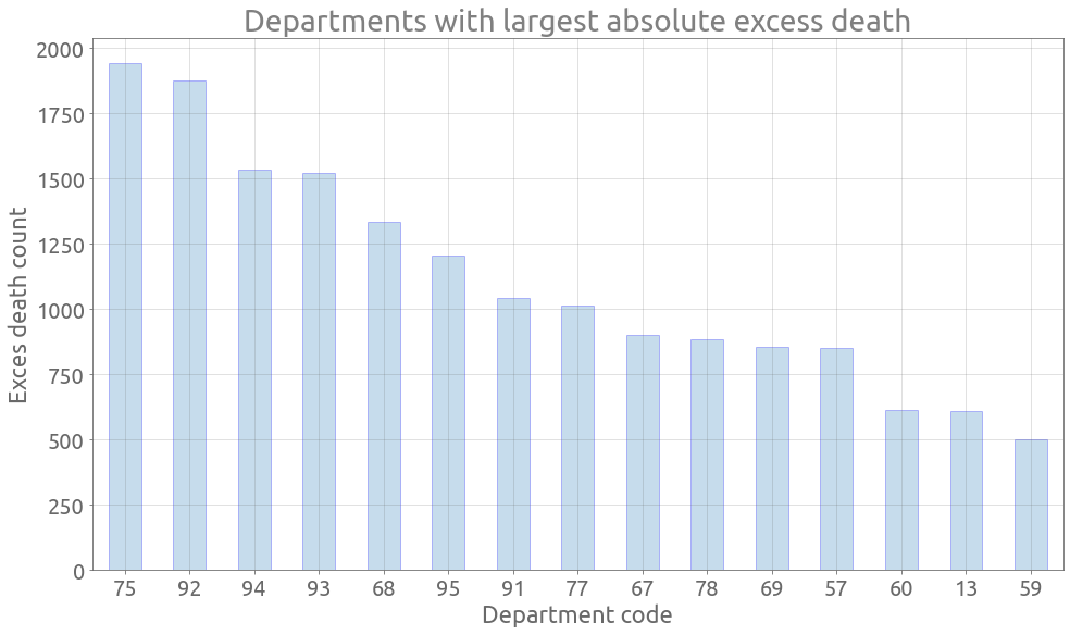
Departments with largest absolute excess death
dep_diff_abs = (dep_2020 - dep_avg).sum(axis=0)
dep_diff_abs_rank = dep_diff_abs.sort_values(ascending=False)
dep_diff_abs_rank.index = dep_diff_abs_rank.index.map(lambda s: s.split("_")[1])
ax = dep_diff_abs_rank[:15].plot.bar(
    figsize=FS, rot=0, grid=True, edgecolor="blue", alpha=0.25
)
_ = ax.set(
    title="Departments with largest absolute excess death",
    xlabel="Department code",
    ylabel="Exces death (%)",
)
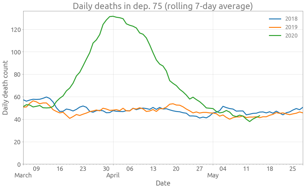
Here is the data for dep. 75 (Paris):
plot_dep(df, "Dept_75")
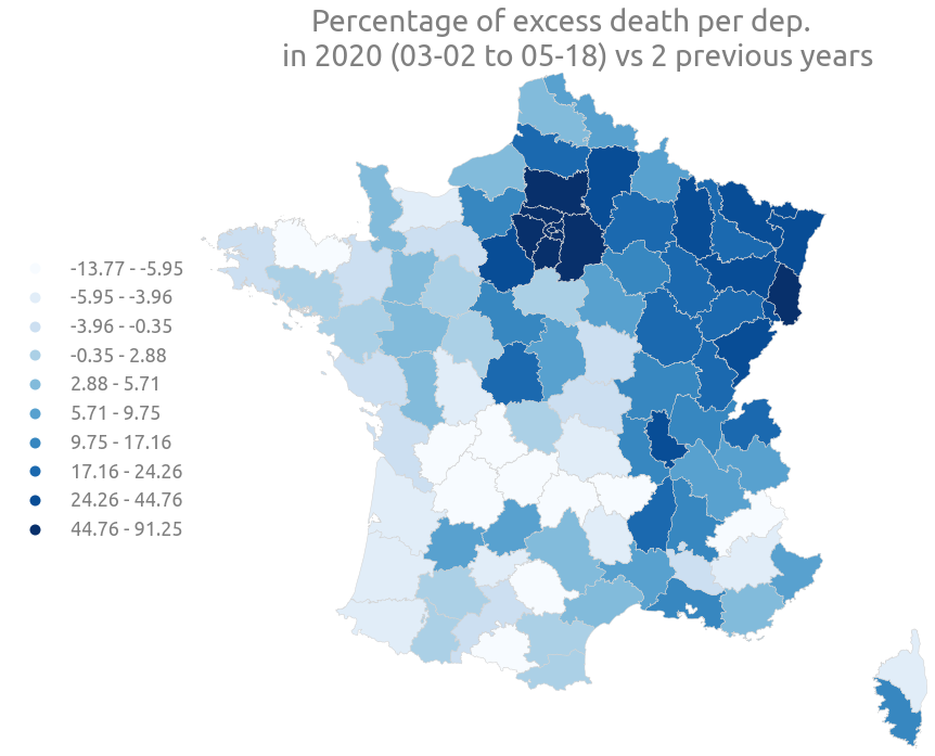
Now let’s plot a choropleth map and color the department zones with relative and absolute excess death.
Choropleth Maps
We focus on metropolitan France (mainland France and Corsica). We first need the contour line of the department zones, which can be found as a GeoJSON file on the french open data portal. We open this file with GeoPandas:
dep = gpd.read_file(
    "https://static.data.gouv.fr/resources/carte-des-departements-2-1/20191202-212236/contour-des-departements.geojson"
)
dep.head(2)
| code | nom | geometry | |
|---|---|---|---|
| 0 | 01 | Ain | POLYGON ((4.78021 46.17668, 4.78024 46.18905, ... |
| 1 | 02 | Aisne | POLYGON ((3.17296 50.01131, 3.17382 50.01186, ... |
We merge these geometries with the previous relative and absolute difference data:
dep_diff_rel = dep_diff_rel.to_frame("diff_rel")
dep_diff_abs = dep_diff_abs.to_frame("diff_abs")
dep_diff_rel["code"] = dep_diff_rel.index.map(lambda s: s.split("_")[1])
dep_diff_abs["code"] = dep_diff_abs.index.map(lambda s: s.split("_")[1])
gdf = dep.merge(dep_diff_rel, on="code")
gdf = gdf.merge(dep_diff_abs, on="code")
gdf.head(2)
| code | nom | geometry | diff_rel | diff_abs | |
|---|---|---|---|---|---|
| 0 | 01 | Ain | POLYGON ((4.78021 46.17668, 4.78024 46.18905, ... | 14.108527 | 136.5 |
| 1 | 02 | Aisne | POLYGON ((3.17296 50.01131, 3.17382 50.01186, ... | 31.902834 | 394.0 |
and use a different projection than lat-lon, so that the shapes are not distorted: EPSG:2154
gdf = gdf.to_crs("EPSG:2154")
ax = gdf.plot(
    column="diff_rel",
    figsize=(12, 12),
    cmap="Blues",
    scheme="quantiles",
    k=10,
    legend=True,
    edgecolor="lightgrey",
    linewidth=0.5,
)
ax.autoscale(enable=True, tight=True)
ax.get_legend().set_bbox_to_anchor((0.0, 0.75))
ax.set_axis_off()
_ = ax.set(
    title="""Percentage of excess death per dep.
    in 2020 (03-02 to 05-18) vs 2 previous years"""
)
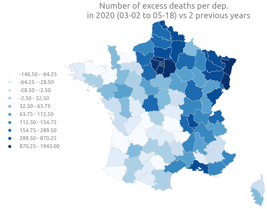
ax = gdf.plot(
    column="diff_abs",
    figsize=(12, 12),
    cmap="Blues",
    scheme="quantiles",
    k=10,
    legend=True,
    edgecolor="lightgrey",
    linewidth=0.5,
)
ax.autoscale(enable=True, tight=True)
ax.get_legend().set_bbox_to_anchor((0.0, 0.75))
ax.set_axis_off()
_ = ax.set(
    title="""Number of excess deaths per dep.
    in 2020 (03-02 to 05-18) vs 2 previous years"""
)