Outlier and Change Point Detection in Data Integration Performance Metrics
Data integration involves combining data residing in different sources, and providing users with a unified view of them. In this post, we are interested in detecting performance drift of large and complex daily data integration processes performed through ETL pipelines, which usually take from several minutes to several hours to complete.
The data correspond to more than 3 years of time performance measurements provided by a single organization, for around 50 distinct data integration processes performed with SAP Data Services, yielding the same number of time series after pre-processing.
Each time serie is assumed to be independent from the others, although there might be some interactions that could be studied with some causal discovery algorithms for example. However our choice is to deal sequentially with univariate time serie problems. These series have a daily frequency and are always strictly positive, due to the fact that they store some elapsed time.
The aim of this post is to detect a potential decay in the time-wise performance of a complex and heavy process. The difficulty is that the underlying data, stored in databases, is evolving during the time span of the study. So does the pipeline that may be adapted and improved from time to time. Also, the background load of database servers or networks may vary.
Here are the steps of the analysis:
- clean/prepare the data
- detect and remove outliers
- detect change points
- extract features on homogeneous time intervals
As a result, we expect to get a single indicator of performance drift per data integration process.
Imports
import pantab
from tableauhyperapi import TableName
import numpy as np
import pandas as pd
import matplotlib.pyplot as plt
from numba import jit
import ruptures as rpt
from ruptures import display
from sklearn.linear_model import LinearRegression
import missingno as msno
import seaborn as sns

%load_ext lab_black

FS = (16, 9)
Loading the data from Tableau and prepare/clean the data
The data is stored as a Tableau Hyper Extract. The pantab package is used to read the Hyper file.
Tableau hyper extract
HYPER_PATH = "./data/ADM_CHARGEMENT_HISTO.hyper"

MIN_LENGTH_RATIO = 0.8  # 1.0 complete, 0.0 empty
MIN_VAL = 30  # values below MIN_VAL are removed

df = pantab.frame_from_hyper(HYPER_PATH, table=TableName("Extract", "Extract"))
df.drop_duplicates(keep="first", inplace=True)
df = df.loc[df.CD_RETOUR == "SUCCES"]  # only keep tasks that succeeded

df["ET"] = (
    df.DT_FIN_EXEC - df.DT_DEB_DONNEES
).dt.total_seconds()  # compute the elapsed time in seconds

# set the index
df["start"] = df.DT_DEB_DONNEES
df.set_index("start", inplace=True, drop=True)

# pivot, resample the time series
traces = pd.DataFrame()
for CD_JOB in sorted(df.CD_JOB.unique()):
    s = df.loc[df.CD_JOB == CD_JOB].ET.copy(deep=True)
    s = s[s > 0.0]
    s = s.resample("D").mean()
    traces = pd.concat([traces, s.to_frame(CD_JOB)], axis=1)
traces.sort_index(ascending=True, inplace=True)

traces[traces < MIN_VAL] = np.NaN  # remove very small values

# remove columns with too many NaN values
length = len(traces)
nan_count = traces.isna().sum(axis=0)
cols = sorted(nan_count[nan_count < (1.0 - MIN_LENGTH_RATIO) * length].index.values)
traces = traces[cols]

# rename the columns, due to confidentiality reasons
traces.columns = ['c_' + str(i).zfill(2) for i in range(len(traces.columns))]
traces.tail(2)
| c_00 | c_01 | c_02 | ... | c_51 | c_52 | c_53 | |
|---|---|---|---|---|---|---|---|
| start | |||||||
| 2019-06-05 | 314.0 | 231.0 | 322.0 | ... | 2062.0 | 1631.0 | 75.0 |
| 2019-06-06 | 311.0 | 239.0 | 170.0 | ... | 2157.0 | 1387.0 | 74.0 |
2 rows × 54 columns
print(f"start: {traces.index.min().date()}, end: {traces.index.max().date()}")
start: 2015-10-05, end: 2019-06-06
Missing values
Let’s visualize the data completion with the handy missingno package.
ax = msno.matrix(traces)
_ = ax.set(title="Data Completion", xlabel="Columns", ylabel="Rows")
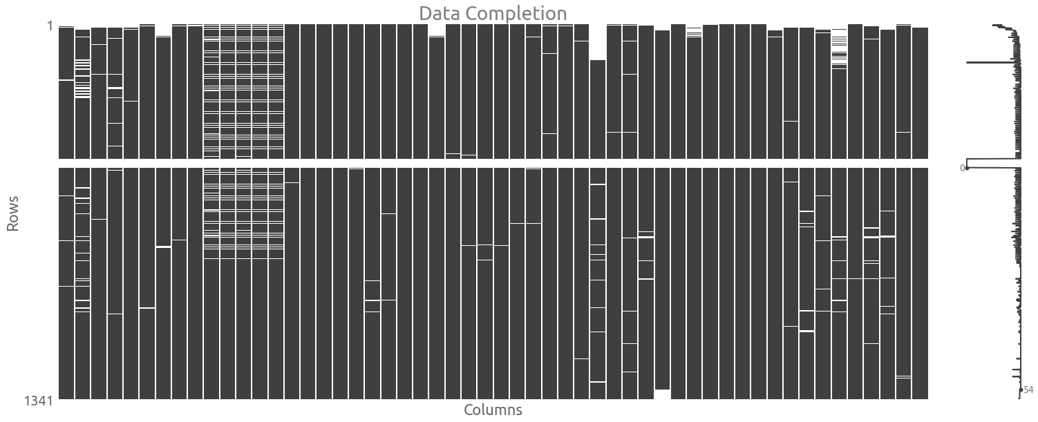
We are going to keep the missing values, so we need to use some methods that can handle NaN values.
Data distribution
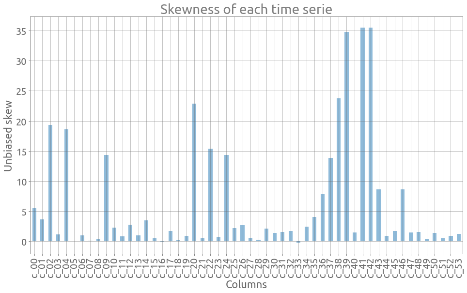
Now we look at the data distribution. Let’s plot the skewness of each serie. For normally distributed data, the skewness should be about zero. We can see here that skewness is rather disparate and that the data is sometimes highly concentrated on the left (small elapsed time) of the distribution:
ax = traces.skew(axis=0).plot.bar(figsize=FS, alpha=0.5, grid=True)
_ = ax.set(
    title="Skewness of each time serie", xlabel="Columns", ylabel="Unbiased skew"
)
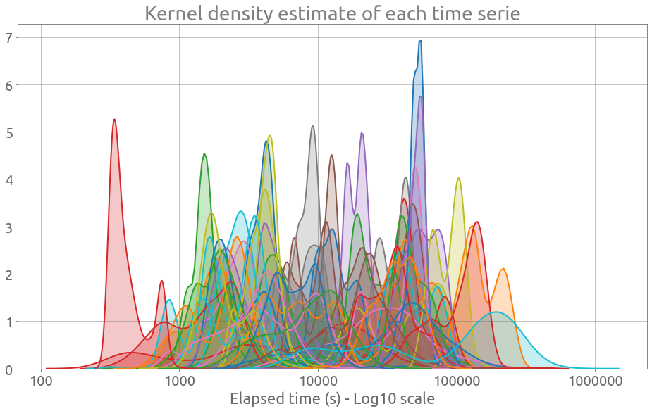
Actually, we can observe that these time series are fairly heterogeneous by plotting all the kernel density estimations:
plt.figure(figsize=FS)
for col in traces:
    sns.kdeplot(np.log10(traces[col].values), shade=True, legend=False)
plt.grid()
ax = plt.gca()
_ = ax.set_xticklabels(
    [10, 100, 1_000, 10_000, 100_000, 1_000_000], minor=False, rotation=0
)
_ = ax.set(
    xlabel="Elapsed time (s) - Log10 scale",
    title="Kernel density estimate of each time serie",
)
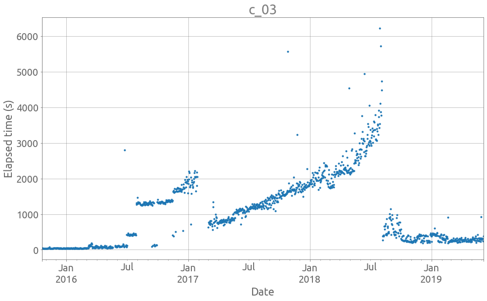
Also, they do exhibit a lot of noise, jumps and more general changes of distribution. We can look at 2 examples using this plotting function:
def plot_ts(idx, tss, logy=False, figsize=FS):
    col = tss.iloc[:, idx]
    ax = col.plot(style=".", figsize=figsize, grid=True, legend=False, logy=logy)
    _ = ax.set(title=col.name, xlabel="Date", ylabel="Elapsed time (s)")
    ax.autoscale(enable=True, axis="x", tight=True)
plot_ts(3, traces)
plot_ts(21, traces)
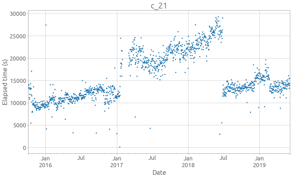
We are interested at the global trend. Let’s start by removing outliers.
Outlier detection
We are looking for an outlier detection method that does not depend on the number of observations, but also that is not much affected by outliers. We are going to use a rolling-window method, on which we compute the median, and the Median Absolute Deviation (MAD). If we have a size $n$ window:
\[y = \left\{ y_i \right\}\]The median and MAD are denoted as follows:
\[\tilde{y} = median \left\{ y_i \right\}\] \[MAD(y) = median \left\{ | y_i - \tilde{y} | \right\}\]Then we can define the modified Z-score:
\[M_i = \frac{0.6745 \left( y_i - \tilde{y} \right)}{MAD(y)}\]Note that 0.6745 is the 0.75th quantile of the standard normal distribution. So we are going to flag each point as outlier if $M_i < -T$ or $M_i > T$. $T$ is a theshold value that has a default value of 3.5 as a rule of thumb. See [1] for more details.
# modified Z-score based method, implemented with Numba


@jit(nopython=True)
def compute_mad_lo(x, threshold):
    x_tilde = np.median(x)
    mad = np.median(np.fabs(x - x_tilde))
    return x_tilde - 1.4825796886582654 * threshold * mad  # 1.0 / 0.6745


@jit(nopython=True)
def compute_mad_up(x, threshold):
    x_tilde = np.median(x)
    mad = np.median(np.fabs(x - x_tilde))
    return x_tilde + 1.4825796886582654 * threshold * mad  # 1.0 / 0.6745


def detect_outliers(ts, window_size=30, threshold=3.5):
    if not isinstance(ts, pd.core.series.Series):
        raise TypeError("ts must be a Pandas Series")
    if not isinstance(ts.index, pd.DatetimeIndex):
        raise TypeError("ts must have a DatetimeIndex")
    if ts.index.freq == "D":
        freq_str = "D"
    else:
        raise ValueError("Wrong time series frequency")
    window_str = str(window_size) + freq_str
    df = ts.to_frame("val")
    df["mad_lo"] = (
        df.val.dropna()
        .rolling(window_str)
        .apply(compute_mad_lo, args=(threshold,), raw=True)
    )
    df["mad_up"] = (
        df.val.dropna()
        .rolling(window_str)
        .apply(compute_mad_up, args=(threshold,), raw=True)
    )
    df["outlier"] = False
    df.loc[(df.val < df.mad_lo) | (df.val > df.mad_up), "outlier"] = True
    return df.outlier
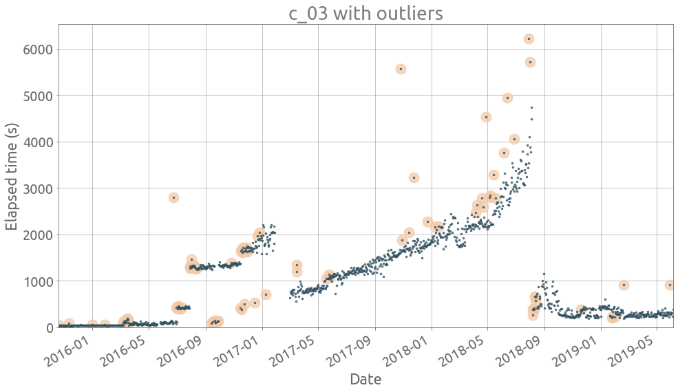
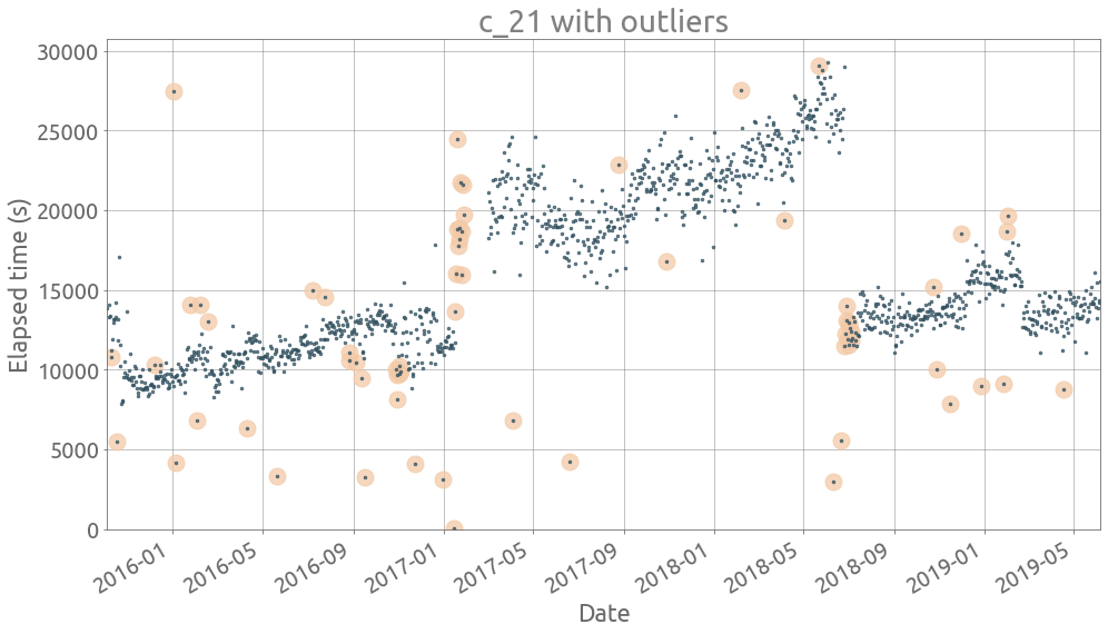
Let’s plot these suspected outliers on given series:
def plot_outliers(ts, outliers, figsize=FS):
    if len(ts.loc[outliers] > 1):
        ax = ts.loc[outliers].plot(
            figsize=figsize, style="o", c="#F3CAA7", ms=15, alpha=0.75, grid=True
        )
        ax = ts.plot(ax=ax, style=".", c="#325160", ms=5, alpha=0.75, grid=True)
        ax.autoscale(enable=True, axis="x", tight=True)
        _ = ax.set_ylim(0,)
        ax.set(title=ts.name + " with outliers", xlabel="Date", ylabel="Elapsed time (s)")
ts = traces[traces.columns[3]]
outliers = detect_outliers(ts)
plot_outliers(ts, outliers)
ts = traces[traces.columns[21]]
outliers = detect_outliers(ts)
plot_outliers(ts, outliers)
Now we actually remove all suspected outliers in each serie:
for col in traces.columns:
    ts = traces[col]
    outliers = detect_outliers(ts)
    traces[col].loc[outliers] = np.NaN
Remove incomplete traces
Removing outliers may result in series with too many missing values. So again, we check if each serie as enough data (at least 80% valid):
nan_count = traces.isna().sum(axis=0)
cols = sorted(nan_count[nan_count < (1.0 - MIN_LENGTH_RATIO) * length].index.values)
traces = traces[cols]
print(len(traces.columns))
48
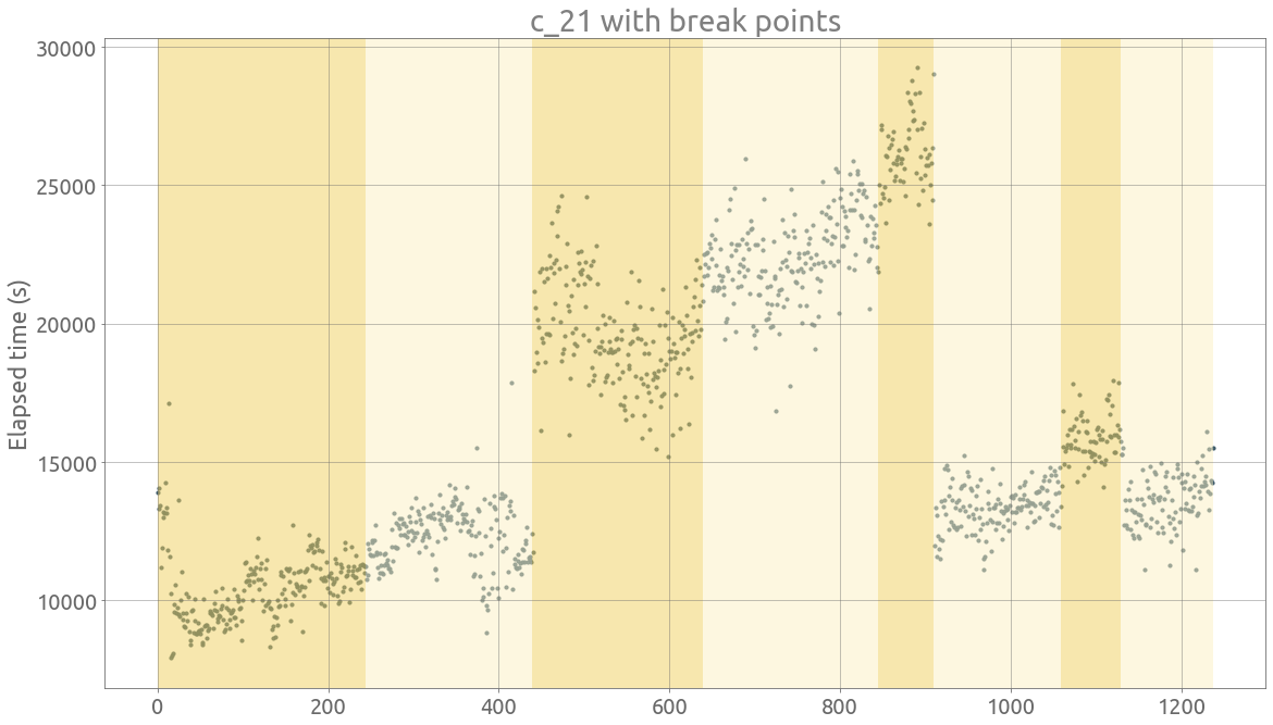
Change point detection
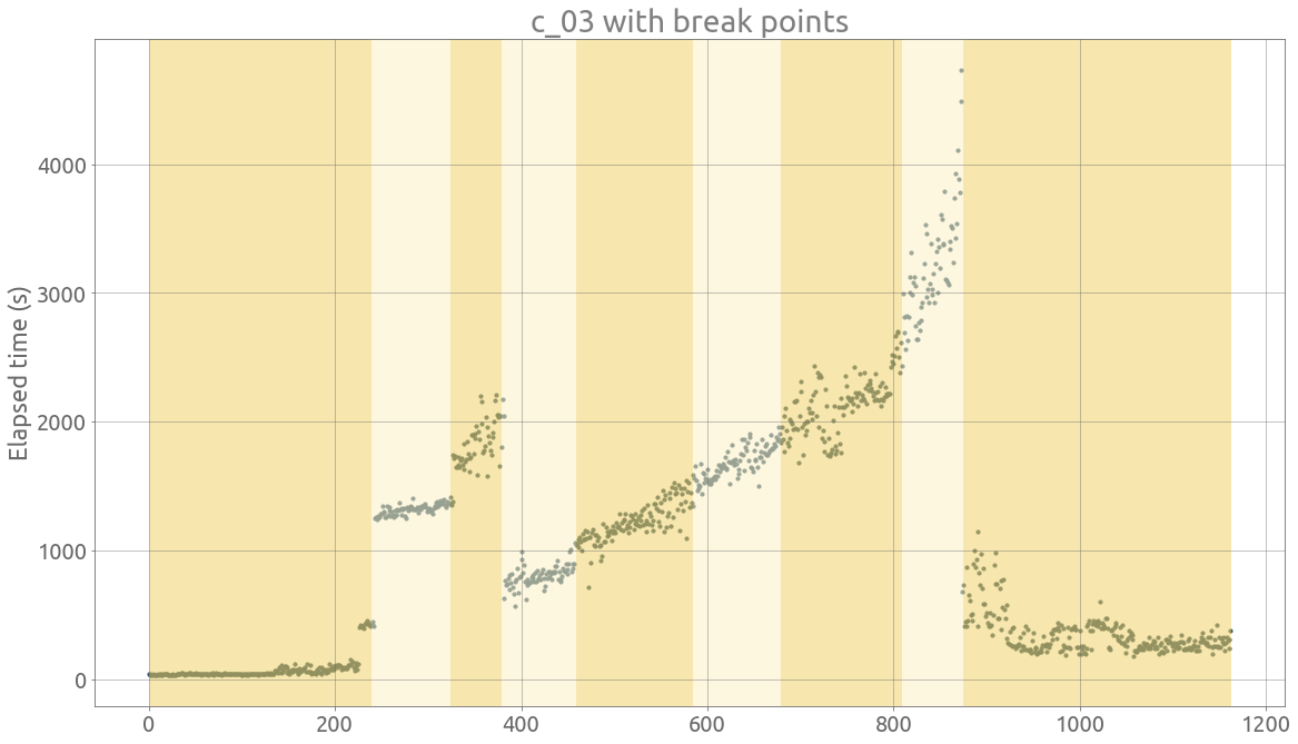
Now we can focus on the change point detection problem. We are going to use ruptures, a nice library for off-line change point detection. Here is a link to the paper associated with the library. As defined in [2]:
Change point detection is the task of finding changes in the underlying model of a signal or time series
Here we are dealing with an unknown number of break points, so a penalty is added to the change point problem with a fixed number of change points $K$. Although ruptures can deal with multivariate signals, we apply the detection algorithms to each time serie separately.
The selected search method is the Pruned Exact Linear Time (PELT) method which is optimal. The cost function is a Gaussian kernel-based mapping. The default penalty function in ruptures is linear, from what we understand. Here is the function that computes and return the breakpoint indices:
def detect_change_points(signal, model="rbf", min_size=5, jump=5, pen=10):
    algo = rpt.Pelt(model=model, min_size=min_size, jump=jump).fit(signal)
    bkps = algo.predict(pen=pen)
    return bkps
ts = traces.c_03
signal = ts.dropna().values
bkps = detect_change_points(signal)
fig, axarr = display(signal, bkps, figsize=FS)
_ = plt.title(ts.name + " with break points")
_ = plt.ylabel("Elapsed time (s)")
ts = traces.c_21
signal = ts.dropna().values
bkps = detect_change_points(signal)
display(signal, bkps, figsize=FS)
_ = plt.title(ts.name + " with break points")
_ = plt.ylabel("Elapsed time (s)")
Feature extraction on homogeneous time intervals
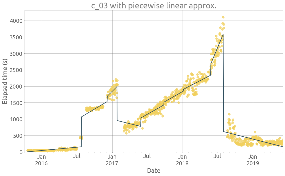
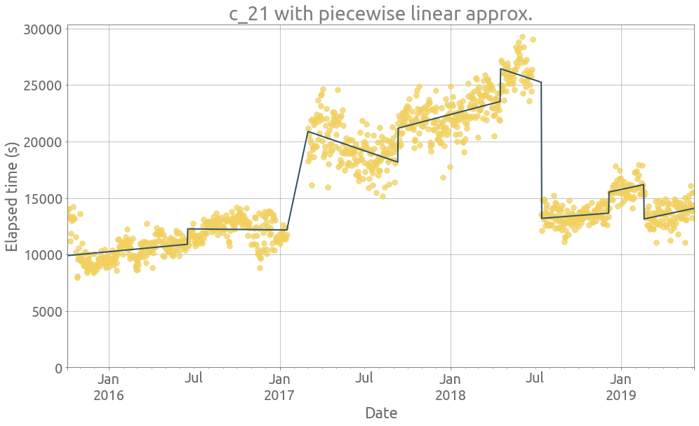
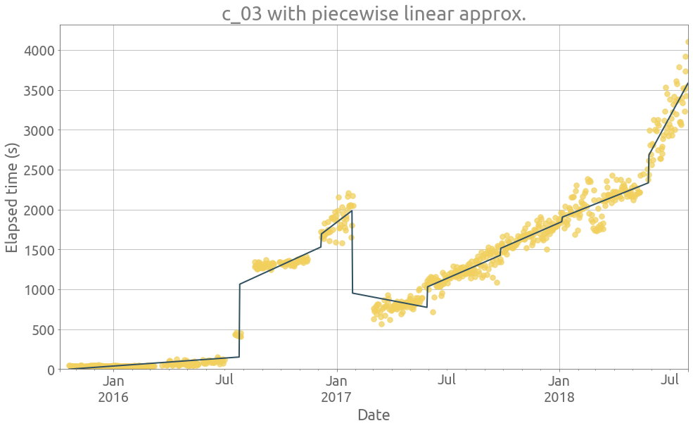
Now that we have removed some outliers and segmented the serie, we are interested computing the slope of each homegeneous segment, to finally compute a slope coefficient, which would indicate if the elapsed time is reather increasing or not. Let’s start with the slope exctraction:
def extract_features(ts_in, plot=True):
    ts = ts_in.copy(deep=True)
    outliers = detect_outliers(ts)
    ts.loc[outliers] = np.NaN
    signal = ts.dropna().values
    name = ts.name
    bkps = detect_change_points(signal)

    df = ts.dropna().to_frame()
    df["segment"] = 0
    df.loc[df.iloc[bkps[:-1]].index, "segment"] = 1
    df.segment = df.segment.cumsum()

    slopes = []
    seg_lengths = []
    df["piecelin"] = 0.0
    df["slope"] = 0.0
    for i in df.segment.unique():
        seg = df.loc[df.segment == i].asfreq("D")[name].reset_index(drop=True).dropna()
        y = seg.values
        X = seg.index.values.reshape(-1, 1)
        reg = LinearRegression(fit_intercept=True, normalize=True).fit(X, y)
        df.loc[(df.segment == i) & ~df[name].isna(), "piecelin"] = reg.predict(X)
        df.loc[(df.segment == i) & ~df[name].isna(), "slope"] = reg.coef_[0]

    outliers = detect_outliers(ts)
    if plot:
        ax = ts.plot(figsize=FS, style=".", c="#F1D05E", ms=15, alpha=0.75, grid=True)
        _ = df.piecelin.plot(ax=ax, c="#325160", grid=True)
        _ = ax.set_ylim(0,)
        _ = ax.set(
            xlabel="Date",
            title=name + " with piecewise linear approx.",
            ylabel="Elapsed time (s)"),

    return df
ts = traces.c_03
_ = extract_features(ts)
ts = traces.c_21
_ = extract_features(ts)
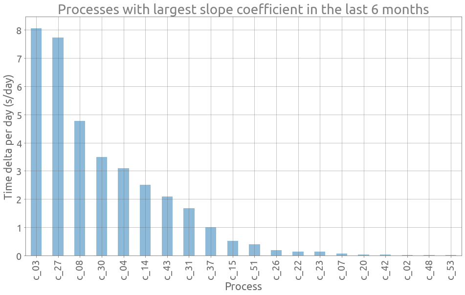
So we would like to detect if a process has been recently taking more and more time to complete. We start by computing a monthly-averaged value of the slope for the last 6 months, and then compute another average of these slope values with non-uniform weights that increase with time (the older, the smaller the weight). We finally get a unique value representing the increase of elapsed time during the most recent months, without taking account outliers and jumps. This slope coefficient is computed for each time serie with compute_slope_coefs:
def weighted_average(y):
    l = len(y)
    alph = np.ones(l, dtype=float)
    for i in range(1, l):
        alph[i] = 1.2 * alph[i - 1]
    alph /= np.sum(alph)
    return np.dot(y, alph)


def compute_slope_coefs(tss, n_days=180):
    slope_coefs = []
    for col in tss.columns:
        ts = tss[col]
        df = extract_features(ts, plot=False)
        months = df[-n_days:].slope.resample("M").mean()
        coef = weighted_average(months.values)
        slope_coefs.append({"column": col, "slope_coef": coef})
    return pd.DataFrame(slope_coefs).set_index("column")
sc = compute_slope_coefs(traces)
Let’s plot the 20 largest slope coefficients:
ax = sc.sort_values(by="slope_coef", ascending=False)[:20].plot.bar(
    figsize=FS, grid=True, alpha=0.5, legend=False
)
_ = ax.set(
    title="Processes with largest slope coefficient in the last 6 months",
    xlabel="Process",
    ylabel="Time delta per day (s/day)",
)
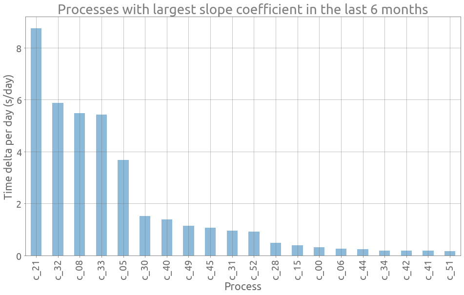
Well we already plotted c_21 and could notice that it was increasing in the last part.
Let’s study the slope coefficients of the months preceding “2018-07”:
sc = compute_slope_coefs(traces[:"2018-07"])
ax = sc.sort_values(by="slope_coef", ascending=False)[:20].plot.bar(
    figsize=FS, grid=True, alpha=0.5, legend=False
)
_ = ax.set(
    title="Processes with largest slope coefficient in the last 6 months",
    xlabel="Process",
    ylabel="Time delta per day (s/day)",
)
ts = traces[:"2018-07"].c_03
df = extract_features(ts)
Final remarks
This aim of this post was to quickly explore ways to detect performance drift in the execution time of large and complex data integration processes. The approach was to remove noise and jumps in the time series data using outlier detection, change point detection and piecewise linear approximation. Then a weighted average of the slope is computed on the last 6 months to result in a single coefficient for each time serie. We could imagine to track this coefficient on a monthly basis.
However this approach strongly depends on two parameters:
- the threshold value for the outlier detection method,
- the penalty coefficient fot the change point detection method.
[1] B. Iglewicz and D. Hoaglin, Volume 16: How to Detect and Handle Outliers, The ASQC Basic References in Quality Control: Statistical Techniques, Edward F. Mykytka, Ph.D., Editor, 1993.
[2] C. Truong, L. Oudre and N. Vayatis, Selective review of offline change point detection methods, Signal Processing, 167:107299, 2020.