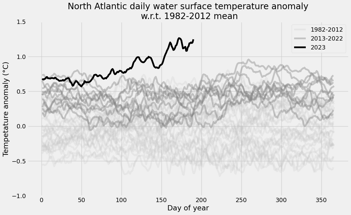
Python plot - North Atlantic daily water surface temperature
Updated July 11, 2023 data update
Data source : https://climatereanalyzer.org (NOAA Optimum Interpolation SST (OISST) dataset version 2.1)
From the NOAA website:
The NOAA 1/4° Daily Optimum Interpolation Sea Surface Temperature (OISST) is a long term Climate Data Record that incorporates observations from different platforms (satellites, ships, buoys and Argo floats) into a regular global grid. The dataset is interpolated to fill gaps on the grid and create a spatially complete map of sea surface temperature. Satellite and ship observations are referenced to buoys to compensate for platform differences and sensor biases.
In the present dataset, the surface temperature is averaged over the whole north Atlantic surface and over the daily time period. The data starts in 1981, and is avalaible until now (with maybe a few days lag).
import matplotlib.pyplot as plt
import pandas as pd
plt.style.use("fivethirtyeight")

FS = (12, 7)  # figure size
Load the Data
The Data is given as a JSON file that we load with Pandas:
df = pd.read_json(
    path_or_buf="https://climatereanalyzer.org/clim/sst_daily/json/oisst2.1_natlan1_sst_day.json"
)
df.set_index("name", inplace=True)
df.head(3)
| data | |
|---|---|
| name | |
| 1981 | [None, None, None, None, None, None, None, Non... |
| 1982 | [20.13, 20.06, 20.0, 20.01, 19.99, 19.98, 19.9... |
| 1983 | [19.76, 19.77, 19.77, 19.75, 19.7, 19.68, 19.6... |
Each year has 366 records with potentially a missing value at the end on non-leap years:
df["data"].map(len).unique()
array([366])
We “explode” the lists and transpose the table in order to have 366 rows and years as columns:
df = pd.DataFrame(df["data"].to_list(), columns=list(range(1, 367)), index=df.index)
df = df.T
df.head(3)
| name | 1981 | 1982 | ... | 2023 | 1982-2011 mean | plus 2σ | minus 2σ |
|---|---|---|---|---|---|---|---|
| 1 | NaN | 20.13 | ... | 20.78 | 20.09 | 20.66 | 19.53 |
| 2 | NaN | 20.06 | ... | 20.76 | 20.07 | 20.63 | 19.51 |
| 3 | NaN | 20.00 | ... | 20.73 | 20.05 | 20.62 | 19.49 |
3 rows × 46 columns
1982-2012 mean
We compute the mean over the different years of the daily values:
year_start = 1982
year_end = 2012
df[f"{year_start}-{year_end} mean"] = df[
    [str(y) for y in range(year_start, year_end + 1)]
].mean(axis=1)
Figure
Now let’s plot the temperature anomaly:
year_start = 1982
year_end = 2012
current_year = 2023
df[f"{year_start}-{year_end} mean"] = df[
    [str(y) for y in range(year_start, year_end + 1)]
].mean(axis=1)
alpha_1 = 0.2
color_1 = "silver"
alpha_2 = 0.4
color_2 = "grey"
color_3 = "black"

ax = (df[f"{year_start}"] - df[f"{year_start}-{year_end} mean"]).plot(
    figsize=FS, color=color_1, alpha=alpha_1
)
for year in [str(y) for y in range(year_start + 1, year_end)]:
    ax = (df[year] - df[f"{year_start}-{year_end} mean"]).plot(
        ax=ax, color=color_1, alpha=alpha_1
    )
ax = (df[f"{year_end}"] - df[f"{year_start}-{year_end} mean"]).plot(
    ax=ax, color=color_1, label=f"{year_start}-{year_end}", alpha=alpha_1
)

ax = (df[f"{year_end+1}"] - df[f"{year_start}-{year_end} mean"]).plot(
    ax=ax, color=color_2, alpha=alpha_2
)
for year in [str(y) for y in range(year_end + 2, current_year - 1)]:
    ax = (df[year] - df[f"{year_start}-{year_end} mean"]).plot(
        ax=ax, color=color_2, alpha=alpha_2
    )
ax = (df[f"{current_year-1}"] - df[f"{year_start}-{year_end} mean"]).plot(
    ax=ax, color=color_2, label=f"{year_end+1}-{current_year-1}", alpha=alpha_2
)

ax = (df[f"{current_year}"] - df[f"{year_start}-{year_end} mean"]).plot(
    ax=ax, color=color_3, label=f"{current_year}", alpha=1.0
)
_ = ax.set_ylim(-1.0, +1.5)
_ = ax.legend()
_ = ax.set(
    title="North Atlantic daily water surface temperature anomaly\n w.r.t. 1982-2012 mean",
    xlabel="Day of year",
    ylabel="Tempetature anomaly (°C)",
)
